经验css项目过程中积累的css技巧
Kahvia Flex布局设置多行首对齐且整体居中
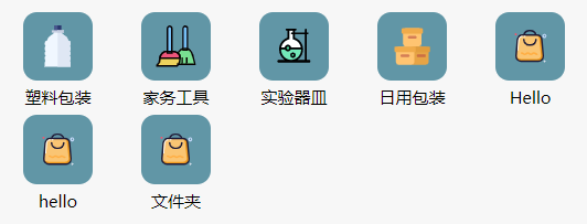
假定项目中的待展示元素宽高固定,每一行要求左对齐,一行最多五个,在此基础上,依据设备的不同,每一行多余的屏幕空间不同。如何将每行排满后多余的屏幕空间分配给该行的每个元素?
答:采用一个空盒子对展示元素进行包裹。对于空盒子,采用 flex-bias 设置一行内所占空间为 20% ,同时空盒子也进行 flex 布局,对展示元素进行水平和垂直的居中处理。
1
2
3
4
5
6
7
8
9
10
11
12
13
14
15
16
17
18
19
20
21
22
23
24
25
26
27
28
29
30
31
32
33
34
35
36
37
38
39
40
41
42
43
44
45
46
47
48
49
50
51
52
53
54
55
56
57
58
59
60
61
62
63
64
65
66
67
68
69
| <template>
<div class="categories">
<div class="wrapper" v-for="category in categories">
<navigator class="navigator-item" url="/pages/index/index" open-type="navigate"
hover-class="navigator-hover">
<image class="icon" :src="category.icon_data" />
<text>{{ category.name }}</text>
</navigator>
</div>
</div>
</template>
<script setup>
import { ref, onMounted } from 'vue'
import { getCats } from '@/services/product';
import { useProductStore } from '@/stores/piniaStores';
import { storeToRefs } from 'pinia';
const { categories } = storeToRefs(useProductStore());
onMounted(() => {
getCats();
})
</script>
<style scoped>
.categories {
width: 100%;
display: flex;
flex-wrap: wrap;
justify-content: flex-start;
margin-top: 10px;
}
.wrapper {
flex-basis: 20%;
display: flex;
justify-content: center;
align-items: center;
}
.navigator-item {
position: relative;
width: 50px;
height: 50px;
margin-bottom: 25px;
background-color: #6196A6;
border-radius: 10px;
display: flex;
flex-direction: column;
align-items: center;
justify-content: center;
}
.navigator-item text {
position: absolute;
bottom: -20px;
font-size: x-small;
font-weight: 500;
color: black;
}
image {
width: 30px;
height: 30px;
}
</style>
|
淡入淡出动画
1
2
3
4
5
6
7
8
9
| <div ref="alert" role="alert"
class="alert w-fit absolute top-0 left-1/2 -translate-x-1/2 transition-all duration-1000"
:class="{ 'opacity-0 invisible': !visible, 'opacity-100': visible }">
<svg xmlns="http://www.w3.org/2000/svg" fill="none" viewBox="0 0 24 24" class="stroke-info shrink-0 w-6 h-6">
<path stroke-linecap="round" stroke-linejoin="round" stroke-width="2"
d="M13 16h-1v-4h-1m1-4h.01M21 12a9 9 0 11-18 0 9 9 0 0118 0z"></path>
</svg>
<span>{{ messgae }}</span>
</div>
|
在添加 transition 的情况下,visibility 的 visible 到 hidden 是 duration 结束后的突变,并不会有过渡效果,而 hidden 到 visible 是 duration 刚开始就突变的。
这意味着元素在获得 hidden 的时候是会因为 duration 而延迟,延迟期间仍然可以进行交互(包括看见、点击、拖拽等等),直到 visibility : hidden被添加。
同样意味着元素在获得 visible 的时候是瞬间生效的,不会因为 duration 有任何的延迟。
这样一来,当我们点击按钮让它显示的时候,它是瞬间出现的。再次点击按钮让它消失的时候,它会等待 duration 度过,然后瞬间消失。
我们只需要添加 opacity 不透明度的变化,让元素在 duration 期间淡入淡出,即可实现视觉和交互层面的淡入淡出。
Flex布局未溢出时居中,溢出时start
参考问答
问题描述:通过 justify-content:center,可以设置 Flex 布局主轴居中,但是溢出设置滚动时,会导致滚动内容异常(居中导致的)。期望效果:未溢出时主轴居中,溢出时 flex-start 的效果。
解决方法:为 flex 盒子添加 before 和 after 伪元素,分别设置外边距 margin:auto。在未溢出的时候,自动外边距会占据剩余的空间,将元素居中。在溢出的时候,该属性会被忽略,正常溢出,无不良效果,即普通的靠左的从左到右依次排列,溢出滚动。
1
2
3
4
5
6
7
| .iconSelector::before,
.iconSelector::after {
content: '';
margin: auto;
}
|